I have coloured all three logo designs on Photoshop, creating a visually interesting set of images which are visually interesting and colourful, which would work well along side my work. The logo being designed to represent my work, with style and colouring. I will now begin the development of preparing promotional products as part of my exhibition work.
Thursday, 27 April 2017
Logo drawings
I have produced three drawings as I decided to design a new logo for my promotional products for the ADI exhibition displaying my Final Major Project work. I chose to draw a snake as a lot of my work as involved illustrations of animals over the last year. I chose to create a logo of a snake as they are my favourite animal, and I find them mysteries and interesting animals, which are full of surprises.
The third drawing is based around the second logo which based on feedback I redrew and added the rattle tale behind the snakes head as the tales representation is key to the idea of representation a snake in artistic work. The text from the first logo will be added on Photoshop to the third snake drawing. I chose the name Achille as I like the name and have associates connected to that name, which I regard highly.
FMP: Comic book
I have had my comic book printed with all the comic pages included, with the front, back cover, and enlarged versions of some of the illustrations in-between the tales within the comic. The comic book is 36 pages including the front, back cover, eight double page comic spreads of the tales with the enlarged versions of the illustrations following the tale on the next double page spread.
For the Great Expectations comic strip I chose to enlarge two illustration over the following two double page spreads as the tale includes more illustrations than any other tale illustrated over a double page spread choosing two which I felt are visually interesting and are the two best drawings form the tale. For the other tales I only chose one illustration to enlarge as I didn't want the comic book to be too big and having a large amount of the pages just representing images and less story telling.
FMP Prism: comic strip
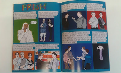
I have completed the development of the Prism comic strip, chosen a set of colours which represent the images with the background for each illustration and the overall background colour for the comic. I chose Turquoise as the background colour, as it can be represented as feelings of sadness, and optimism as the tales tells of how a person of all different ages is optimistic about their different ages, but it turns to sadness later down the line.
I layered the illustrations and text on the page to best fit alongside each other to a more professional standard, be visually interesting and represent the story clearly.
FMP Prism: Photoshop colour illustrations
The Photoshop colour illustrations I produced for the Prism tale have been coloured influenced by the references illustrated from and for the colours for the comic spread to match and create a colourful interesting visuals for the spread.
For the Prism title I coloured the font with six different colours including red, orange, yellow, green, blue, and purple the six colours from the colour wheel. The colours also transmit through the prism once light touched it. The title font representing the tale as the light splits into a number of different fragments of light, Similar to how the tale presents the split in ages of people.
I will begin the development of preparing my final comic page spread.
FMP Prism: written text
These are the sections of text from the tale which I chose to illustrate from, I will like the other comic strips include my own produced hand font as part of the comic pages, giving the comic a more personal feel instead of boring lettering font from the computer, which I believe would not work as well as part of the comic along side my drawings, looking out of place.
FMP Prism: illustrations
I have produced a number of drawings influenced from the Prism tale from SUM Forty tales from the afterlifes. The drawings are illustrated from certain sections of text I chose from the tale to illustrate. Again the comic is intended to represent the basic story of the tale creating visuals for the tale.
I chose to produce illustrations for this tale as I found it interesting while reading it, wanting to experiment with different ages, and explore different ways of representing people through different ages.
The title is drawn as a line font which I intend to colour with six different colours the same which transmit through a prism.
Saturday, 22 April 2017
FMP Narcissus: Comic strip
I have completed the Narcissus double page comic strip. I chose to colour the background orange as the colour can be represented as searching for something and fascination, which the tale is set around the creators of humans wanting them to explore the world adding to their data collection of the world. I also chose an orange background colour as I believe the colour fits well with the colour pallets for the illustrations and it is yet a colour I have used as background for a comic strip.
I layered the illustrations and texts to best fit on the comics pages, focusing on position and size. The layering of the comic designed to give the spread professional element which works well on both pages.
FMP Narcissus: Photoshop colour illustrations
I have produced the Photoshop colour illustrations for the Narcissus tale. Again colouring some of the illustrations similar to the references influenced on and creating a colour pallet which makes the illustrations more visually interesting.
I now intend to begin the development of creating the Narcissus tale double page comic strip.
Subscribe to:
Comments (Atom)


